For old input & output format, see here.
General
At their most fundamental level, connectors are data manipulation tools, so the data that flows in and out of them is crucial to make a connector useful. Inputs are the data pieces that come from an external source (other methods, connectors, or functions) and are used throughout your connector. Outputs are the data pieces that are sent out from your connector, and are able to be used throughout your Flow.
Inputs and outputs functionally work almost exactly the same. They are declared exactly the same, can be all the same types, and take almost all of the same modifiers. The main difference however, is that outputs are often rendered in a slightly different way inside of a Flow, to optimize for the operations you’ll want to perform on data coming out of a connector. So, for the majority of the Inputs & Outputs section, inputs and outputs will be treated interchangeably.
Inside of a connector, inputs and outputs always start with “headers” (or group names) at the top level, and fields inside of those headed subsections. As you can see with this example, our inputs are grouped into two sections with headings:
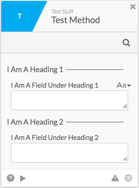
To define this, we would declare our inputs in the “input” section of a connector method, like so (Note: defining outputs would be the same, except we’d be defining them in the “output” section):
{
    "extensible": false,
    "attributes": [
        {
            "name": "I Am A Heading 1",
            "attributes": [
                {
                    "name": "I Am A Field Under Heading 1",
                    "type": "string"
                }
            ]
        },
        {
            "name": "I Am A Heading 2",
            "attributes": [
                {
                    "name": "I Am A Field Under Heading 2",
                    "type": "string"
                }
            ]
        }
    ]
}
You can see the outlines of our groups here as you would expect, but let’s dive into what each specific field means:
- attributes (top-level):This represents the subsections of the input/output section of the connector method. Each item in this array is an object with a name (the heading), and its attributes (the fields inside it).
- name: The heading name.
- attributes: The fields inside of this group, underneath the heading. All items inside of this array represent a field underneath the same heading, each field will have at least a type and a name, with potentially its own nested attributes array, and other flags/settings as well.
- name: The name of the field.
- type: The type of the field (must be string, Date, number, boolean, object, or file).
- attributes: The sub-fields of that field, only if the parent field is of type “object”.
After all of this, our connector would have statically-defined inputs surfaced to the user. This means that any value that the user puts in could now be referenced inside of our connector method using ”{{input.headingName.fieldName}}“.
Additionally, you may customize inputs and outputs by changing their types and setting modification flags (explained in the section “Customizing UI with Types and Flags”). Furthermore, you may also dynamically generate inputs and outputs (explained in the section “Dynamic Inputs and Outputs”).
Customizing Your UI- Types & Modifiers!
Before getting started:
Note #1: Before getting into this guide, make sure that you’ve read the general guide about connector inputs and outputs- it’ll make understanding this guide much easier!
Note #2: This content only applies to connectors created after 4/20/17, or those with a connector flag “enableNewMetadata” set to true. Otherwise, your connector will run on old dynamic input and output format. To use this new format, navigate to this URL in connector builder, with the appropriate values subbed in: https://build.ui.azuqua.com/(ORG ID)/(CONNECTOR NAME)/full. Once there, underneath the key “channelformat”, add in “enableNewMetadata” and set it to true.
Although we can support many connectors with the basic input and output options (“name” and “type”), there are many connectors that may benefit from having slightly more control over how users can interact with your connector. You can do this by altering the types of your connector filed, which affects how that data can interact with other items inside of your users Flows, or by altering modifiers which change how the information is presented to your users.
The ways you can affect what type your connector field is by:
- _Using any of Azuqua’s standard types- _Setting these appropriately can completely change the way users interact with your connector. Setting a connector field to accept strings may be the most generalized way you can pass around information in Azuqua, but restricting fields to only be certain types allows for more accurate errors, etc from Azuqua at runtime. The supported types are “string”, “object”, “Date”, “file”, “boolean” and “number”.
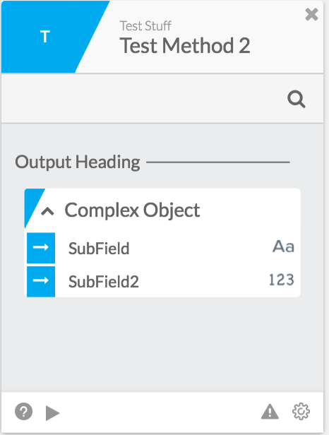
_Creating a complex object as an output field- _When a connector field is set to be of type “object”, it can be a simple object, where the user just passes in/receives an object with any fields inside of it. However, outputs inside of Azuqua connector methods may also be a complex object, with a specific structure of fields defined before runtime.
- Inside of a Flow, this will look like this:
To enable this, set your “type” to be “object”, and then define an attributes array, with all of your subfields inside of it. Each subfield will be declared just like normal fields are. Like so:
{
    "extensible": false,
    "attributes": [
        {
            "name": "Output Heading",
            "attributes": [
                {
                    "name": "Complex Object",
                    "type": "object",
                    "attributes": [
                        {
                            "name": "SubField",
                            "type": "string"
                        },
                        {
                            "name": "SubField2",
                            "type": "number"
                        }
                    ]
                }
            ]
        }
    ]
}- _Setting a field to be a collection- _You may also set a field to accept/output a collection of items of any type.
- To enable this, set the _“type” field of your input/output field object to be the type you want each item in the collection to be. Then, add a “collection”_ field, and set it to true. Like so:
{
    "extensible": false,
    "attributes": [
        {
            "name": "Heading",
            "attributes": [
                {
                    "name": "Collection Of Strings",
                    "type": "string",
                    "collection": true
                }
            ]
        }
    ]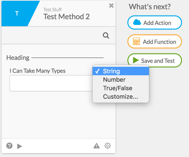
}_Setting available types for input fields- _You can also set the option for users to be able to pass in multiple types to a field. This means that the user will select which type they would like to pass in, and then drag the appropriate value in.
- Inside of a Flow, this will look like this:
To enable this, add the “available” collection inside of your input object, and add whatever types you would like to allow inside that collection. Example:
{
    "extensible": false,
    "attributes": [
        {
            "name": "Heading",
            "attributes": [
                {
                    "name": "I Can Take Many Types",
                    "type": "string",
                    "available": [
                        "string",
                        "number",
                        "boolean"
                    ]
                }
            ]
        }
    ]
}- Setting an input field to take in an option- Input fields may also be set to appear as dropdowns, rather than fields that users drag items into, or input manually. When doing this, make sure to think critically about whether or not this input should be a parameter instead.
- To do so, set your “type” to be “option”, and add in a _“choices” array. Inside of that “choices” _array, you can add any field you would like to appear in your dropdown, in either a string format (shown below) or as an object containing a “label” and “value” property. Here’s an example:
{
    "extensible": false,
    "attributes": [
        {
            "name": "Heading",
            "attributes": [
                {
                    "name": "I Am A Dropdown",
                    "type": "option",
                    "choices": [
                        "Choice1",
                        "Choice2",
                        "Choice3"
                    ]
                }
            ]
        }
    ]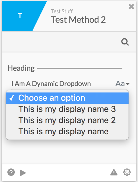
}- * You may also dynamically generate your list of options, by declaring your option field, and make sure that your helper function outputs a list of options properly. Example:
Input Object
{
    "extensible": false,
    "attributes": [
        {
            "name": "Heading",
            "attributes": [
                {
                    "name": "I'll Be Dynamically Generated",
                    "metadata": "dropdownOptionGenerator"
                }
            ]
        }
    ]
}
Output Of Helper Function
Step: Push | list.push
STEP_EXECUTION_COMPLETE
{
  "list": [
    {
      "name": "I Am A Dynamic Dropdown",
      "choices": [
        {
          "label": "This is my display name 3",
          "value": "But I Actually Equal This 3"
        },
        {
          "label": "This is my display name",
          "value": "But I Actually Equal This"
        },
        {
          "label": "This is my display name 2",
          "value": "But I Actually Equal This 2"
        }
      ]
    }
  ]
}
Resulting Card
The modifiers you can use to affect how your connector field behaves is by:
- _Setting inputs to be required- _If your service has some values that are required to operate properly, you can set a field to be required. When an input field is set to be required, it will cause Azuqua to display an error to the user if it is not filled out.
- To enable this, add in a “required” field and set it true inside of your input object. Like this:
{
    "extensible": false,
    "attributes": [
        {
            "name": "Heading",
            "attributes": [
                {
                    "name": "I Am Required",
                    "type": "string",
                    "required": true
                }
            ]
        }
    ]
}- Setting a default value for your input- Sometimes it’s useful to set a default value for inputs that are not required, in case the user hasn’t filled them out.
- To do so, simply set a “defaultValue” field inside of your input object. Make sure that your value is set to the same type as your field. Example:
{
    "extensible": false,
    "attributes": [
        {
            "name": "Heading",
            "attributes": [
                {
                    "name": "I Have A Default Value",
                    "type": "string",
                    "defaultValue": "foo"
                }
            ]
        }
    ]
}- Setting a distinct display name for your input or output- It can be quite useful to have the name your user sees while building Flows with your connector be different than the name you use internally to use that input/output value. This allows you to change your input/output’s name on your card without having to change anything about how your connector works.
- To do this, set a _“displayname” _field inside of your input object to be the value you would like to appear on your card.
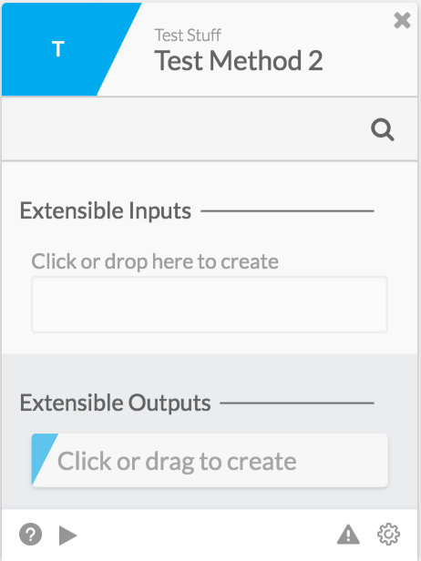
- Setting your input/output field to be an extensible set of items- Sometimes you want your connector method to be able to take in many user-defined fields. To do this, you can set your input/output field objects to be “extensible”. While users are building a Flow with your card, they’ll be able to add as many fields and values as they would like.
- While building a Flow, your card will appear like this:
To enable, set an “extensible” flag to true inside of your extensible heading group instead of an “attributes” array.
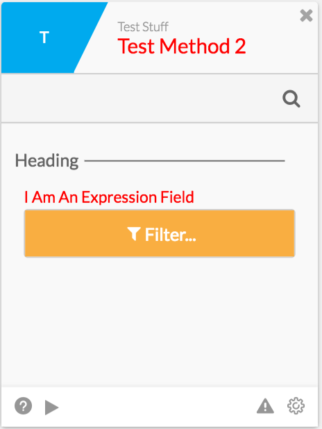
Setting your input field to be surfaced to users using the “expression builder” UI- You can also have fields that will surface in the designer using our expression builder UI, so you can ensure that all expressions that are passed into your connector are valid.
- While building a Flow, your card will appear like this:
To enable, set a flag _“expr” _to true inside of your input field.
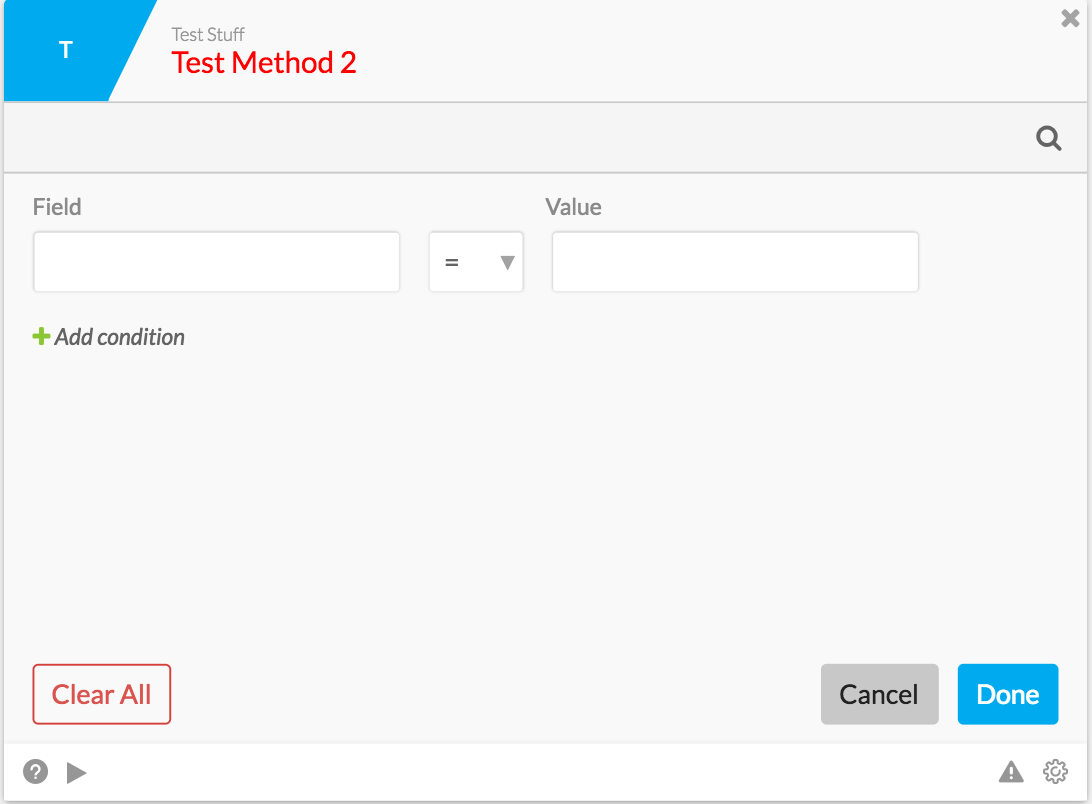
- If you would like to make the left side of the expression builder (“Field”) be a dropdown, you may add the _“exprFields” array. This “exprFields” _can also be dynamically generated. The below example will show all three types of expression builder configurations.
{
"extensible": false,
"attributes": [
{
"name": "Input Heading",
"attributes": [
{
"name": "empty",
"type": "string",
"expr": true
},
{
"name": "static",
"type": "string",
"expr": true,
"exprFields": [
{
"type": "string",
"name": "foo"
},
{
"type": "number",
"name": "bar"
},
{
"type": "boolean",
"name": "baz"
}
]
},
{
"name": "dynamic",
"type": "string",
"expr": true,
"exprFields": "loadExpressionFields"
}
]
}
]
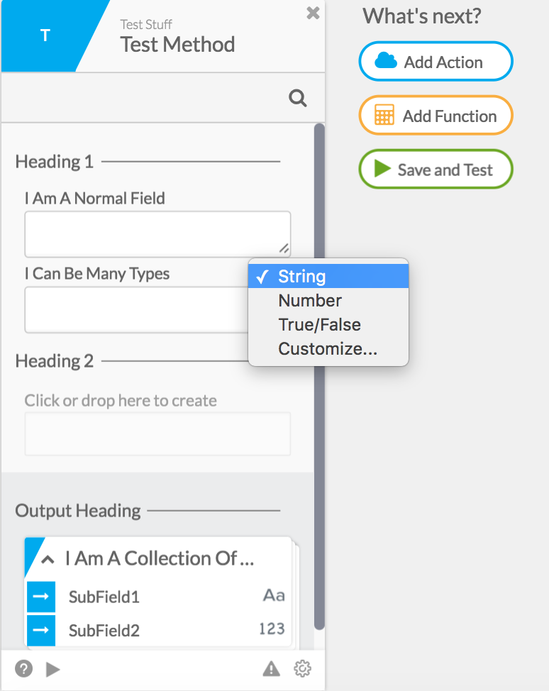
}All of these extra items on top of your inputs and outputs are applied at the field-level. For example: Input Section:
{
    "extensible": false,
    "attributes": [
        {
            "name": "Heading 1",
            "attributes": [
                {
                    "name": "I Am A Normal Field",
                    "type": "string"
                },
                {
                    "name": "I Can Be Many Types",
                    "type": "string",
                    "available": [
                        "string",
                        "number",
                        "boolean"
                    ]
                }
            ]
        },
        {
            "name": "Heading 2",
            "extensible": true
        }
    ]
}
Output Section:
{
    "extensible": false,
    "attributes": [
        {
            "name": "Output Heading",
            "attributes": [
                {
                    "name": "I Am A Collection Of Complex Objects",
                    "type": "object",
                    "collection": true,
                    "attributes": [
                        {
                            "name": "SubField1",
                            "type": "string"
                        },
                        {
                            "name": "SubField2",
                            "type": "number"
                        }
                    ]
                }
            ]
        }
    ]
}
This would end up rendering like this for users as they add this connector method to a Flow:
Unless otherwise noted, you may mix and match these type flags and modifiers however you would like, on both inputs and outputs on your connector method UIs, as you can see in the above examples.
Dynamic Inputs & Outputs
NOTE: This content only applies to connectors created after 4/20/17, or those with a connector flag “enableNewMetadata” set to true. Otherwise, your connector will run on old dynamic input and output format. To use this new format, navigate to this URL in connector builder, with the appropriate values subbed in: https://build.ui.azuqua.com/(ORG ID)/(CONNECTOR NAME)/full. Once there, underneath the key “channelformat”, add in “enableNewMetadata” and set it to true.
To see documentation for the old format, see this link.
Dynamic inputs and outputs allow you to generate your input or output structure using a helper function. This structure will then be rendered onto your card’s UI. When setting up dynamic inputs/outputs, there are two items you’ll need to adjust. First, is declaring the helper function in the input/output section of your connector method. To do so, take the “attributes” section you would like to dynamically generate, and replace it with this (making sure you use the “regular” form of your function name):
[
  {
    "metadata": "helperFunctionNameHere"
  }
]
Using this, you can dynamically generate in most places. Say you wanted to dynamically generate all fields, including the header sections. Your input section would look like so (Example #1):
{
  "extensible": false,
  "attributes": [
    {
      "metadata": "getFields"
    }
  ]
}
Or, if you wanted to just dynamically generate the fields underneath a static header, you could define your inputs like so (Example #2):
{
  "extensible": false,
  "attributes": [
    {
      "name": "Heading Example 2",
      "attributes": [
        {
          "metadata": "getFields"
        }
      ]
    }
  ]
}
Now that you’ve told the engine to pull your inputs/outputs from a helper function, we have to make sure to handle the second part of dynamic UI - making sure our helper function properly generates the UI. To do this, first create a helper function under “Functions”. Now, we need to make sure that your helper function outputs the correct information in the correct format. The general rule of thumb with helper functions that dynamically generate inputs/outputs is to have your helper function return exactly what you would have filled into your attributes array statically.
If we take Example #1 (see above), where we are dynamically generating an entire heading and all of its fields, we would need our helper function to output something like this:
[
  {
    "name" : "Heading For Example 1"
    "attributes" : [
      {
        "name" : "Field 1",
        "type" : "string"
      },
      {
        "name" : "Field 2",
        "type" : "number"
      }
    ]
  }
]
Note that this is a list, because if we had wanted more groups of fields, we would have needed another object that contained those fields. Or, if we wanted to complete Example #2, where we were just dynamically generating fields underneath a static heading, our helper function’s output would need to look something like this:
[
  {
    "name" : "Field 1",
    "type" : "string"
  },
  {
    "name" : "Field 2",
    "type" : "number"
  }
]
Once you’ve done those two pieces, you’ve successfully gotten dynamically generated UI done for your connector method! The above two examples are quite basic, so feel free to add any types, or flags you would like. Finally, dynamically generated UI is really helpful when they are dependent on other values. Specifically, most dynamic input/output situations rely on either authentication values (username, password, instanceURL, etc) or parameter values. Both of these value sets are passed in and available to helper functions that are called from the engine when UI is generated. Authentication information is available in your helper function using “{{auth.authFieldName}}”, and parameter information is available by using “{{input.data.paramFieldName}}”.